Fujifilm Color Chrome Effect: How To Recreate In Affinity Photo
Back in 2017, camera nerds (myself included) were very excited by the arrival of Fujifilm's first digital medium format mirrorless camera: the Fujifilm GFX 50S.
It featured a sensor 1.7x larger than your usual full-frame 35mm digital camera sensor, in a small body, and promised incredible resolution and that oft-desired "medium format look". And all for considerably less money than the, at the time, current crop of digital medium format cameras.
The GFX 50S included Fujifilm's "film simulations", much like Fujifilm's previous APS-C sensor X-series cameras, but added an extra feature for this medium-format beast: the Color Chrome effect.
The inspiration behind the Color Chrome effect
According to the Fujifilm-X website:
The inspiration for this look comes from FUJICHROME Fortia, a color reversal film that was only available in Japan between 2005 and 2007. Fortia famously promised "more contrast and color than Velvia". The ultra-saturated look that Fortia delivered attracted a cult following, but because it was only made in limited quantities, not many photographers had the chance to try it - until now!
To give you an idea of what colours you could achieve on Fujichrome Fortia film, I've included some slides below:
Photo: biel* "hello, colors of summer!" by * tathei *
Photo: F1000034 by Vega Tenor
Photo: Untitled by akino ringo
As you can see, the colours on Fujichrome Fortia SP are rich, vibrant, and deep... but I wouldn't say "out of control". They're not Agfa Ultra 50 colours.
To my eye, and of course you're free to disagree, I find these colours just wonderful to look at.
Fujifilm sought to bring back those rich and deep tones of Fortia SP for their new Fujifilm GFX50s medium format camera. The result is called the Color Chrome effect, available in-camera in two strengths: Weak or Strong.
Quoting from Fujifilm-X again:
Usually, when photographing colors such as red, orange, or green under high-contrast conditions, it's easy for an RGB color channel to become overloaded - as if individually too bright. Under these conditions, with contrast and brightness at a maximum, there is no room for a full range of tones and the scene tends to look a bit flat. But with Color Chrome switched on, subtle differences of tone can be detected and enhanced. The result is a punchy, high saturation image that doesn't lose its impact and depth.
This in-camera setting was later ported over to several of Fujifilm's X-series of APS-C mirrorless cameras, such as the X-T3 and the T-30.
Older X-series cameras, such as my beloved X-T2, may never gain this setting.
But, I think I figured out to replicate this in Affinity Photo (you can translate this guide to Photoshop, if you want).
Here's how.
The Fujifilm Color Chrome effect tutorial
The image we're starting with I downloaded from DPReview's X-T4 sample gallery.
Photo by Richard Butler for DPReview. Processed in Capture One, no noise reduction and no sharpening using the Provia (Standard) film simulation.
After some personal edits of the RAW file (change from Provia to Velvia, slight vignetting and minor contrast curve), this is the edit that I'll be applying the Color Chrome effect on.
Step 1: Load your edit in Affinity Photo.
Step 2: we're gunna first apply a small degree of colour boosting using Affinity Photo's curves adjustment. So add a Curves Adjustment layer.
Step 3: switch the colour mode of the Curves Adjustment from RGB to LAB.
Step 4: Switch the channel you want to edit from "Master" to "AOpponent".
Step 5: drag the bottom-left point of the Curve to the first line, then drag the top-right point to the third line. This creates a very extreme "s-curve". Working in the LAB colour mode allows us to modify only the Chroma (colours) of the image without altering its Luma (lightness). The colours affected in the "AOpponent" channel are Red and Green.
Step 6: switch to the "BOpponent" channel and repeat the same curve. This will affect the Blue and Yellow colours in the LAB colour mode.
The colour boost will be very strong, so feel free to reduce the opacity on this Curves Adjustment layer.
Step 7: we need to create a mask that will allow us to target only the colours that are strongly saturated i.e. a Saturation Mask. You can make one using a Selective Colour Adjustment layer.
Step 8: first, make sure you uncheck the "Relative" checkbox in the Selective Colour Adjustment window.
Step 9: for each colour in the Colour dropdown list, you'll want to move the "Black" slider all the way to the left. In this instance, we're already in the "Reds" colour, so slide the "Black" slider all the way left, to -100%. Then do some with Yellows, Greens, Cyans, Blues, and Magentas.
Step 10: for the next three "colours" in the Selective Colour Adjustment window ("Whites", "Neutrals", and "Blacks") you'll want to do the opposite and slide the Black slider all the way to the right, at 100%.
You'll end up with a weird grayscale image.
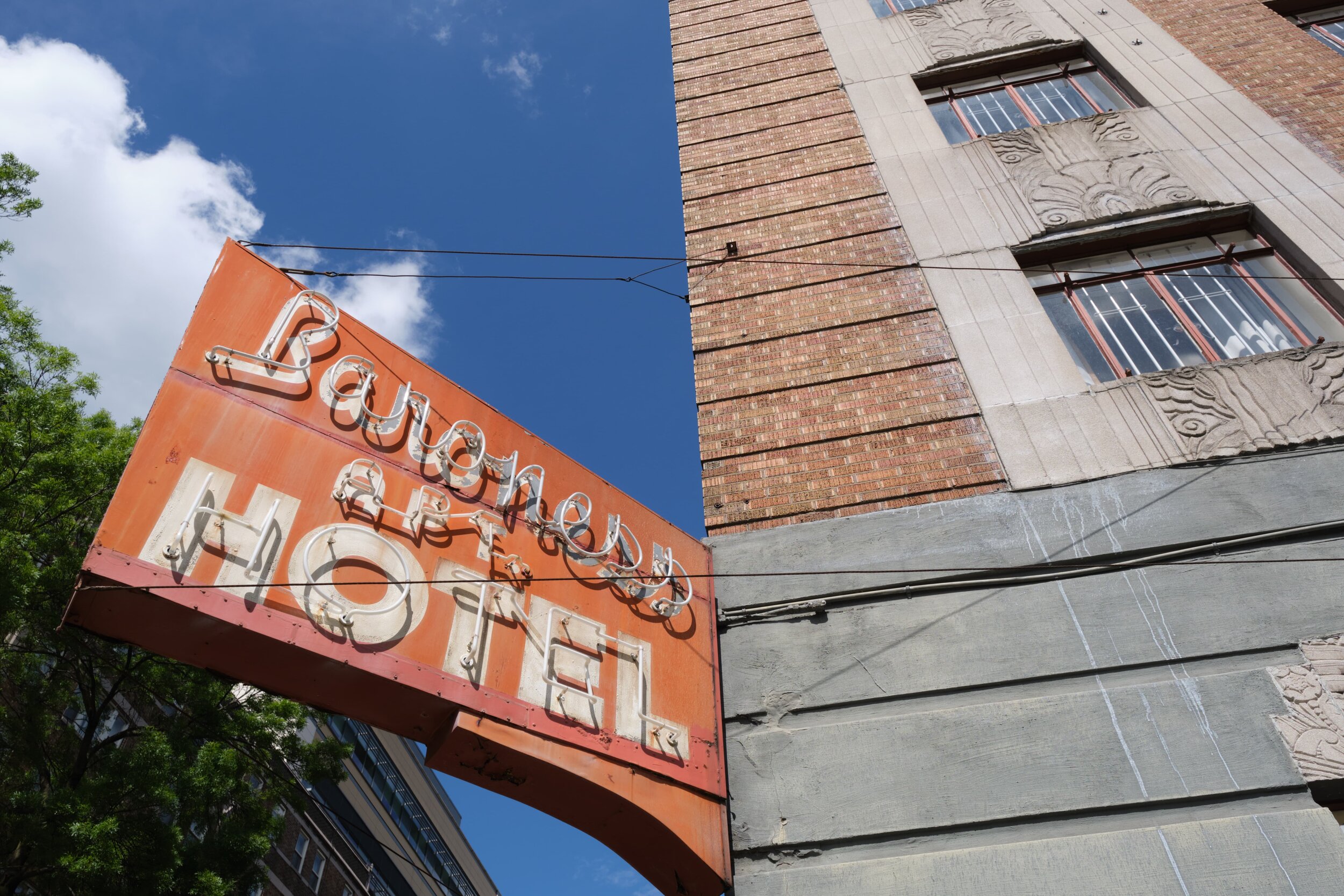
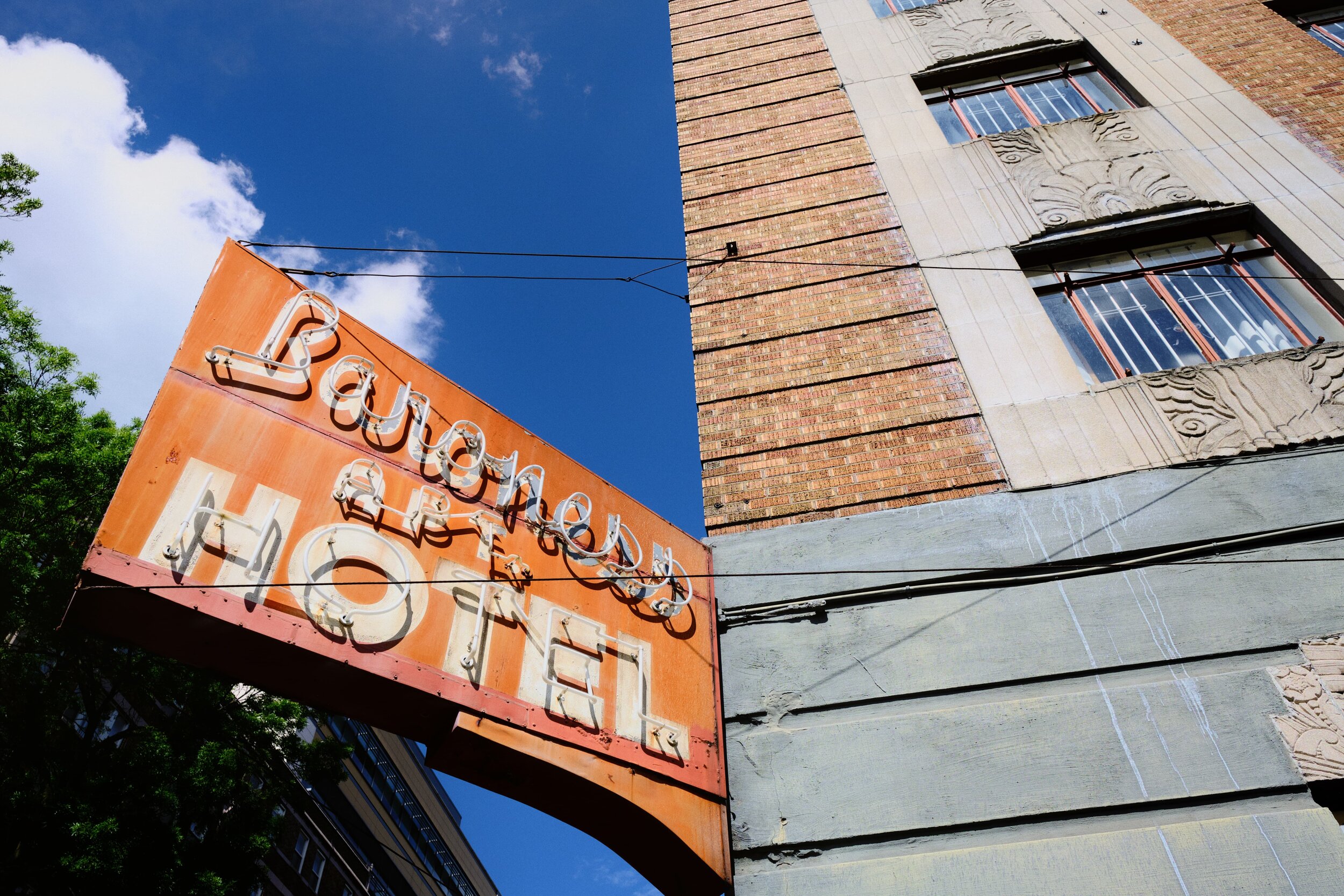
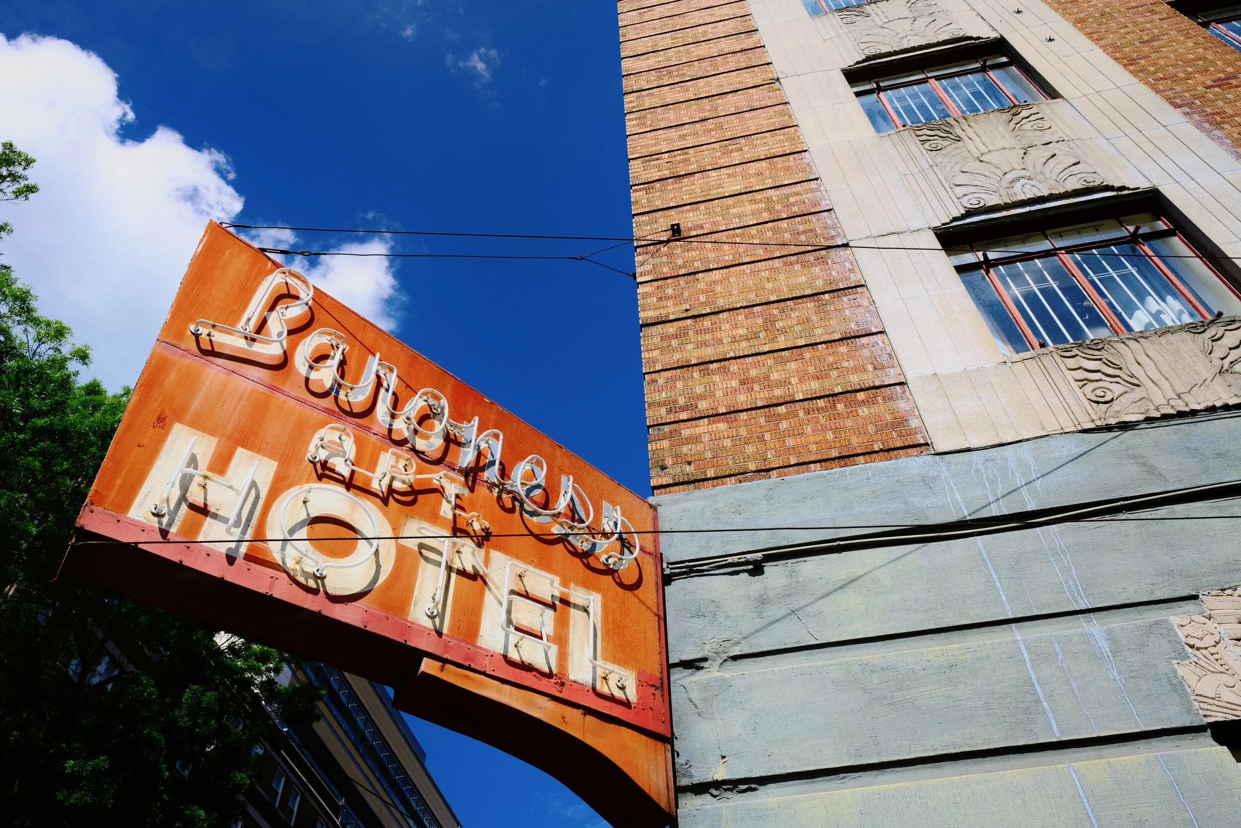
This is your Saturation Mask. It's a grayscale interpretation of where your most saturated colours are in the image. The closer to white the mask is, the more saturated a colour is. The closer to black the mask is, the more desaturated a colour is. In the image shown, the sign (which we know is red/orange) is very bright in this mask, indicating that the colours here are very saturated. Conversely, the grey wall towards the bottom-right of the image are represented as nearly black in this mask, telling us that the colours here are very desaturated.
Let's convert and save this into a mask.
Step 11: create a new "stamped" pixel layer of the Saturation Mask. Go to "Layer" in the menu, then "Merge Visible".
This will create a new pixel layer on top of your layer stack, filled with the Saturation Mask.
Step 12: right-click on the thumbnail of this new Pixel Saturation Mask layer and select "Rasterise to Mask".
Parts of this pixel layer will now go slightly transparent. This is fine.
Step 13: in the Channels panel, right-click on the thumbnail labelled "Mask Alpha" and select "Create Spare Channel".
This stores the Saturation Mask as a Spare Channel, for later use.
Back in the Layers panel, you can now safely delete the "(Mask)" layer and the "Selective Colour Adjustment" layer.
Step 14: this is the final stretch. Right-click on the Spare Channel you created, which contains the image's Saturation Mask, and select "Load To Pixel Selection". You'll get some "marching ants" dancing around your image, indicating that a selection is active.
Step 15: with the selection active, create a Curves Adjustment layer and change its Colour Mode from RGB to LAB. This new layer will load the selection you've made onto the Curves Adjustment layer as a mask. In short, you've added the Saturation Mask onto the Curves Adjustment layer.
This now means that any adjustment you make to this Curves Adjustment layer will affect only the most saturated colours in the image, because this adjustment is controlled by the Saturation Mask attached to it.
Step 16: change the channel in the Curves Adjustment window from "Master" to "Lightness".
Step 17: create a point in the middle of the curve and drag it down to darken the tones.
Because the Curves Adjustment is in LAB colour mode, and we're editing the Lightness channel, the edit we're making to the curve is only affecting the image's Luma (lightness), and not touching any of the colours. Furthermore, because we have a Saturation Mask attached to the Curves Adjustment layer, this means we're darkening the brightness of only the most saturated colours in the image.
This is the Color Chrome effect.
Let's have a look at some comparisons, shall we?
Conclusion
Do you think this is an accurate replication of Fujifilm's in-built Color Chrome effect? Do let me know, especially if think any improvements can be made.
Free Downloads
If you use Affinity Photo, I've created some free Macros that will automate the creation of the LAB Colour Boost and the Saturation Mask, important steps to recreating this Color Chrome effect.
Download: LAB Colour Boost
Download: Saturation Mask